Meta Quest
Mobile App

Meta Quest Mobile App was a 0-1 redesign project that combined app simplification, mature styling, and focused in on VR companion use cases only. I led this redesign, partnering with 2 PDs on their specific app areas and 2 PDs on the design system update.

Prototype

Before

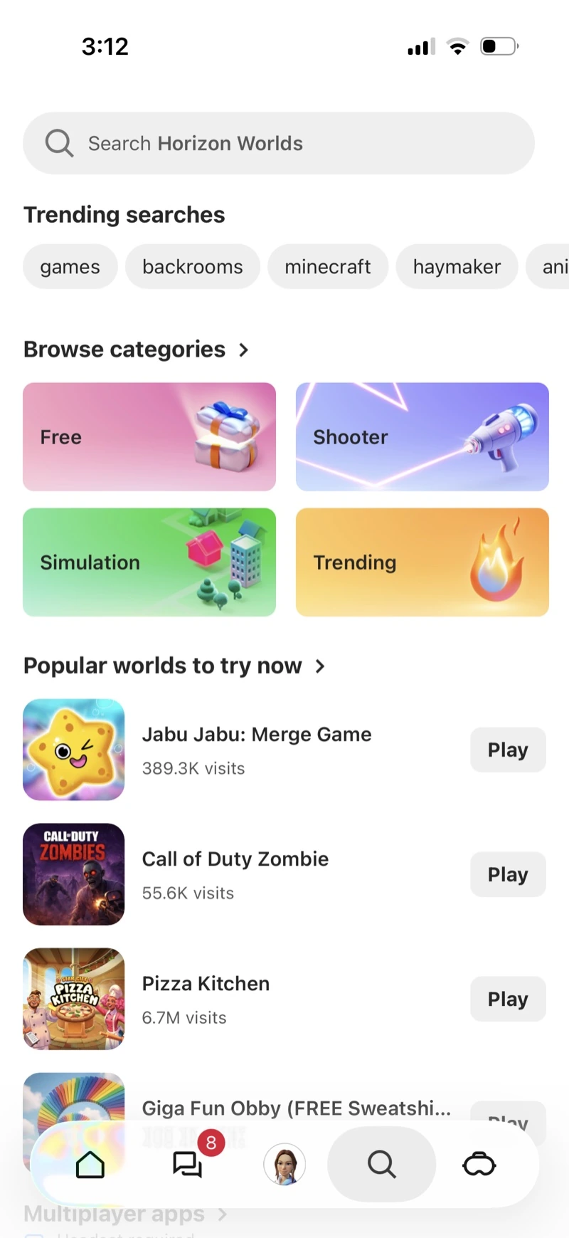
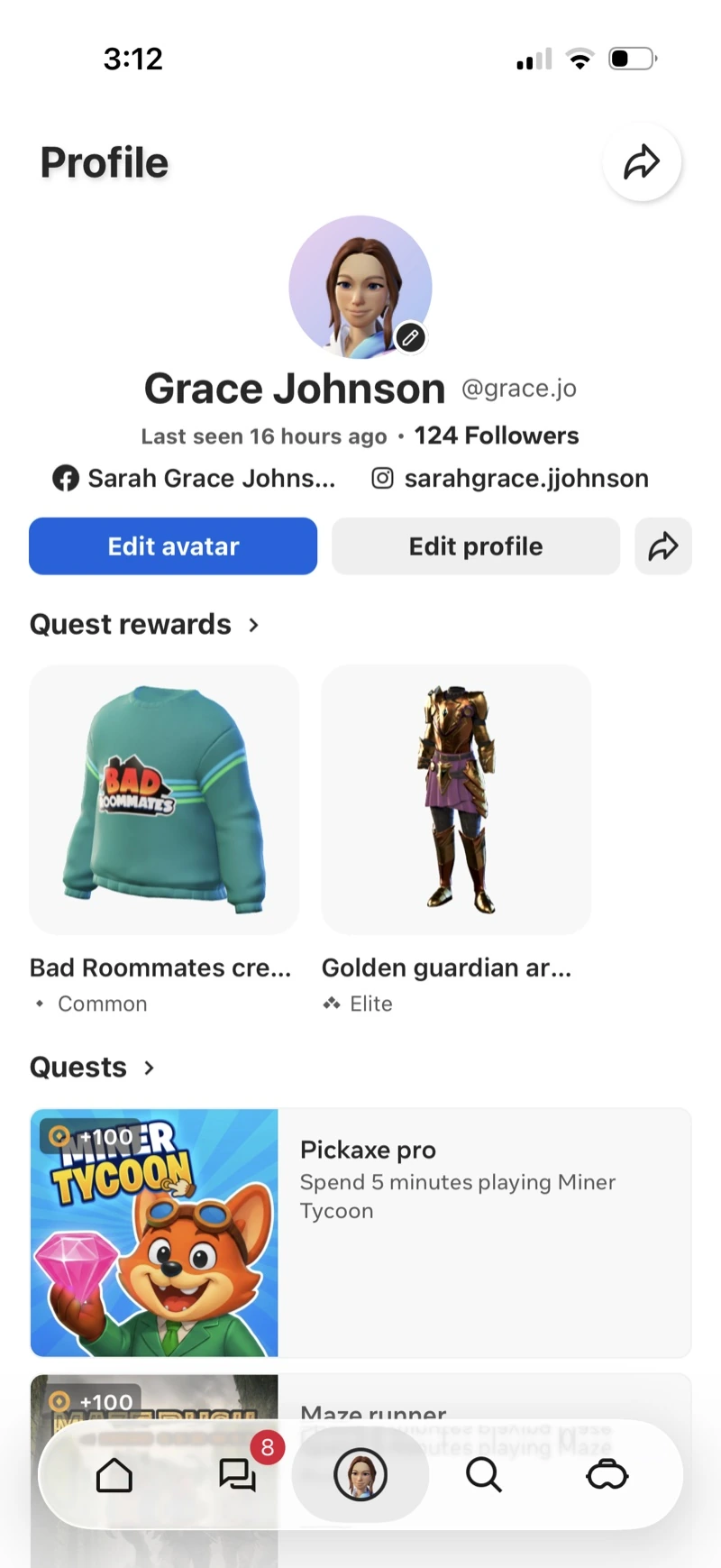
Our mobile app suffered from too many competing features & use cases: mobile playable worlds, quests, avatar items, VR content discovery, and VR device management.
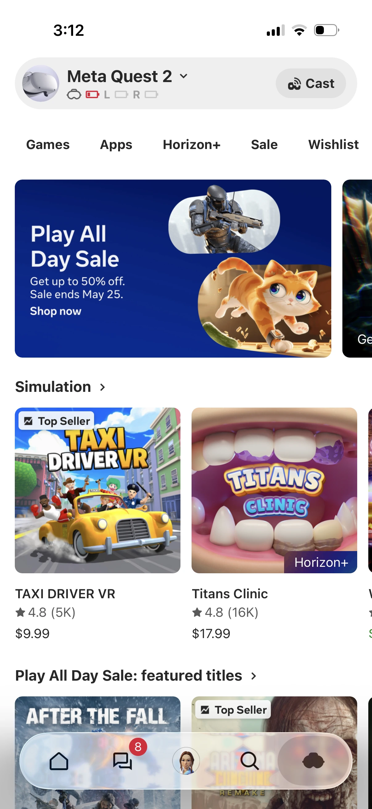
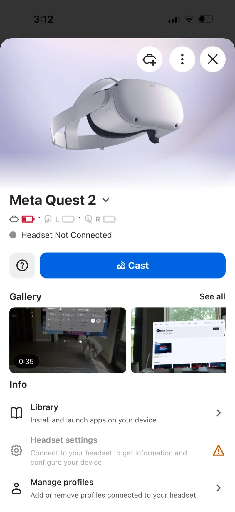
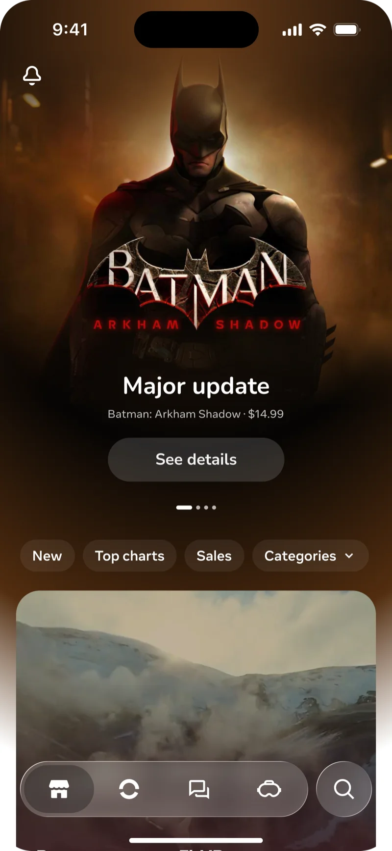
Today — Store
Today — Device
Today — Search
Today — Profile

Key problems

People were having difficulty finding VR companion app features such as device management and VR content discovery.

There was a lack of clarity around what suggestions were apps and which were worlds. Most people were not interested in both and found mixing them together on pages frustrating.

Overall, the app was busy, cluttered, and not intuitive to browse or use for specific use cases.
Product context

VR Focus

For 2 years prior to this redesign, our mobile app was cluttered with competing jobs between VR companion and mobile playable worlds. At the kickoff of this project, we had a strategic pivot to focus the app solely on the VR companion use case.

Mature visual tone

As part of moving away from a focus on playable worlds, we also wanted to elevate our visual style to appeal less to kids, and focus on the mature adult demographic.

Simplification

In order to deliver an experience that lived up to our ambitions for the next generation of VR computing, we also needed to massively simplify every touch point of our experiences.

Process

Before this formally became a project, another designer and I were already (separately) toying with the idea of redesigning mobile — I started by gathering up the past explorations and doing a deep dive into data and research.

Exploration 1

Design credit to Tomas Brennessl

Exploration 2
Exploration 3

Design credit to Tomas Brennessl

Exploration 4

After painting a clear picture of what's working and what's not (early explorations for inspiration), I held a workshop to align with stakeholders on what to cut and how to prioritize what's left.

Aligned

🧭 Content discovery is a top priority.

🥽 Device management is a top priority.

🗺️ Feed is redundant with Store.

👧🏽 Profile is still important, but secondary.

💬 Chats and social is no longer a priority.

⚙️ Settings should be accessible, but secondary.

🔍 Search should be part of the main navigation.

Controversial

💰 Horizon+ program's prioritization and prominence.

Needs follow-up

🔵 Notifications need a higher quality bar to justify.

🎬 Does NUX personalize the app, or is it just device setup?

Next, I focused ideation around these prioritization decisions and explored options for Horizon+ placement (the controversial topic). I led this design effort, consulting with local designers who owned specific feature areas of the app on the design of their pages.

Option 1

Option 2

After getting feedback from designers, I iterated and expanded this option set for IA review with design leads and local XFN partners.

Option 1

Option 2

Option 3

Organizational context

At this point, the local team was happy with the direction but pushing for a bit more content density and visibility of features at the top level. However, design leadership (ex Apple) were bullish on hyper-simplification and wanted to see more rounds with a focus on that.

This direction from design leadership marked a significant shift in the Meta Reality Labs design culture — one welcomed by most designers.

Principles

Sophisticated

We favor restraint and obsess over the details. Precise typography, balanced proportions, clear hierarchy, and subtle detail and craft. The overall tone is calm and assured, so users feel guided, not sold to.

Decisive

We surface the right choice at the right moment, using strong visual hierarchy, and avoiding clutter or ambiguity that forces extra thinking — always making the next step obvious. Primary actions are prominent, copy is direct, and flows remove hesitation so people can move with confidence.

Intelligent

The app understands context. It remembers preferences, adapts layouts to usage, and offers relevant shortcuts and recommendations without asking twice. Discovery adjusts over time, prioritizing content based on behavior.

Solution

Proposal — Home
Proposal — Device
Proposal — Search
Proposal — Profile

Core jobs

  1. VR content discovery
  2. Device management
  3. Device setup (isolated NUX flow)
Mobile home
For you Device Search

Secondary jobs

  1. Notifications
  2. Manage my stuff (settings, profile, saved)
Notifications Profile
Mobile home

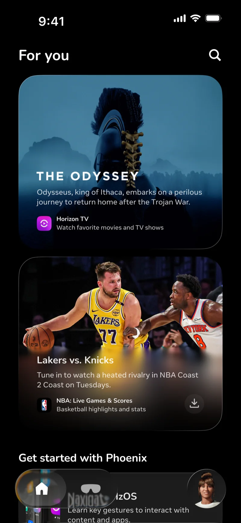
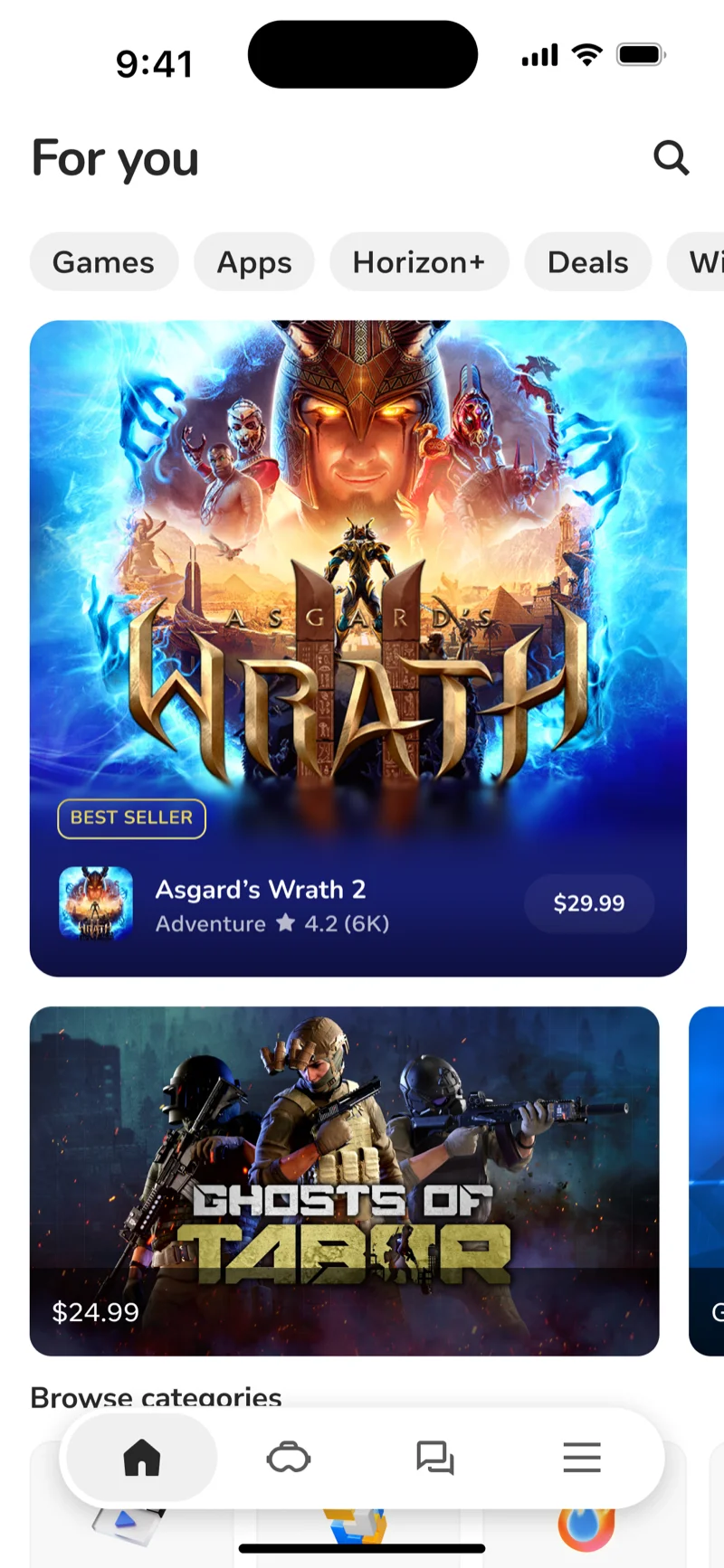
For you

VR content browsing, the most frequent reason people use this app, upleveled as the landing experience.

Before — Store

Before

Proposal

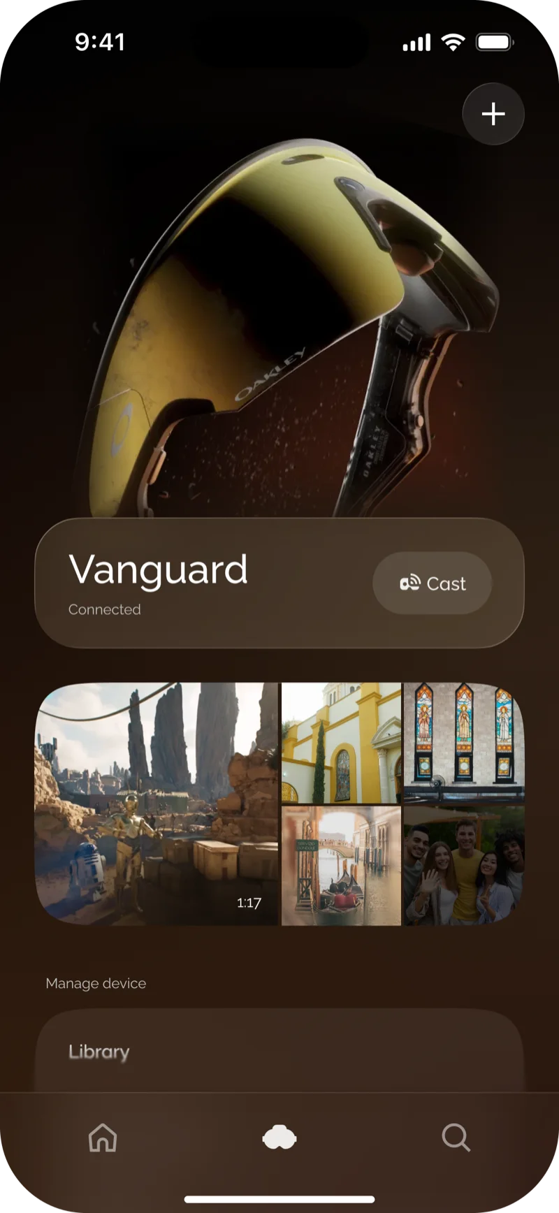
Device

Focused experience on the main use cases: casting and gallery access. Other settings and menus are rarely used and thus placed in accessible but secondary locations.

Before — Device

Before

Proposal — Device

Proposal

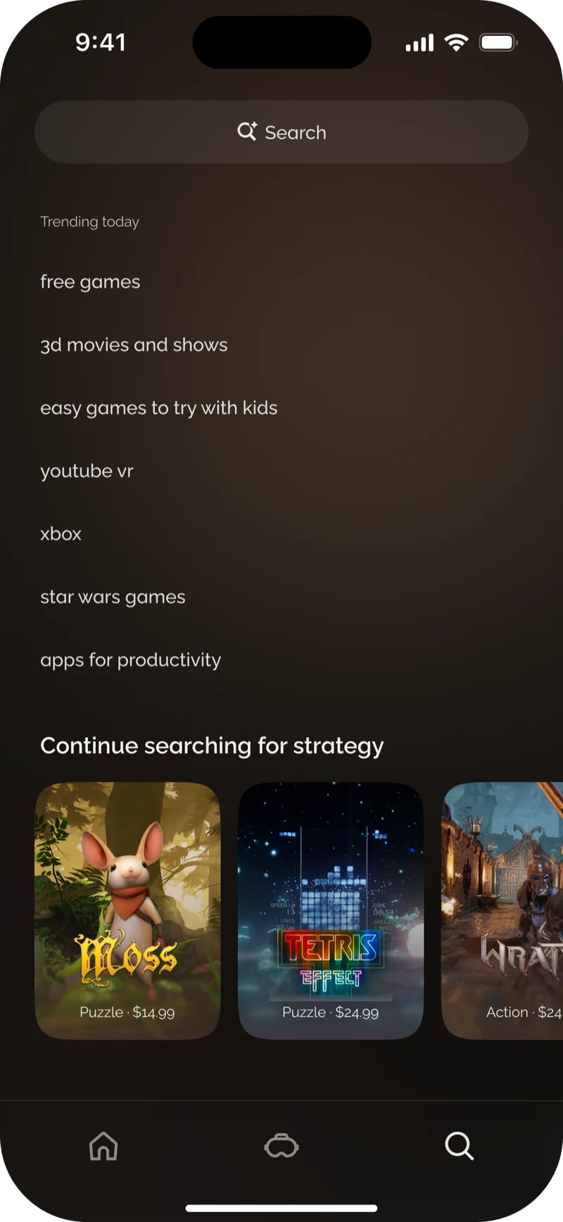
Search

Simplified and upleveled with fresh and personalized suggestions

Before — Search

Before

Proposal — Search

Proposal

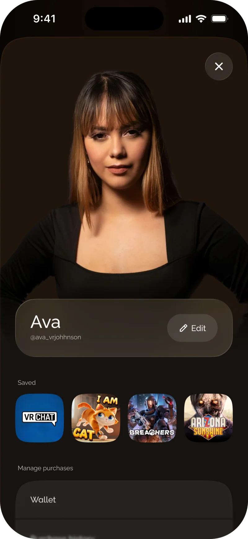
Profile

Prioritizing avatar editing and saved content, which are strategic priorities.

Before — Profile

Before

Proposal

Impact

This work set the standard for simplification and the updated design system on mobile—up until the day I left Meta, this work was POR and in implementation.

Next steps were exploring deeper AI integrations and personalization throughout the experience — not pictured for confidentiality.

Reflections

What went well?

The design overall order of operations and collaboration between all parties was extremely positive.

What would I do differently?

I would bring in design leadership earlier, treating them as a team stakeholder to make the information architecture process more efficient.

sgficke@gmail.com | Résumé