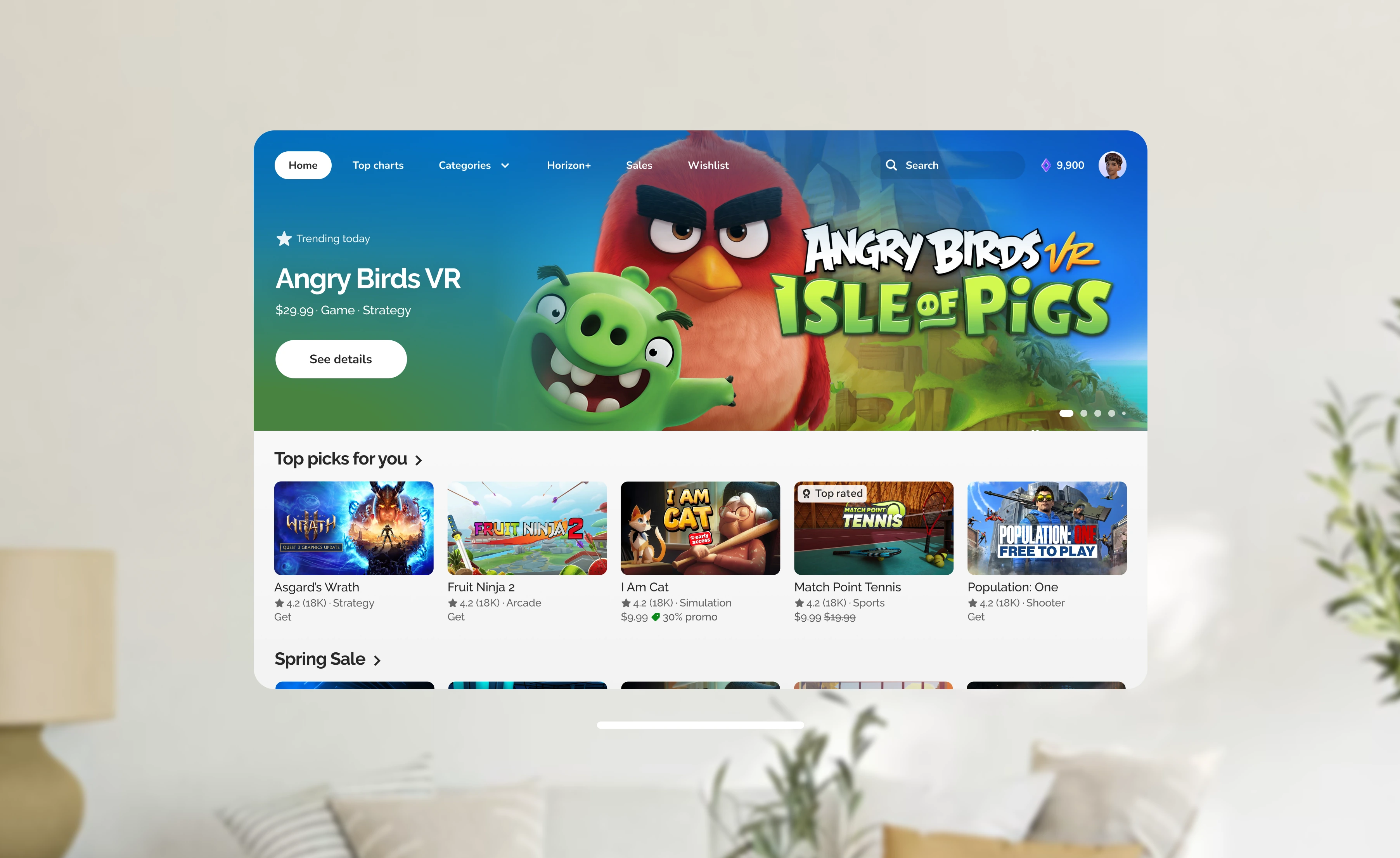
How I led the end-to-end redesign of VR Store's Design System — from units, page rhythm, to cohesion across pages.
UXR indicates that it's not immediately clear that the Store is scrollable — due to the subtle scroll affordance.
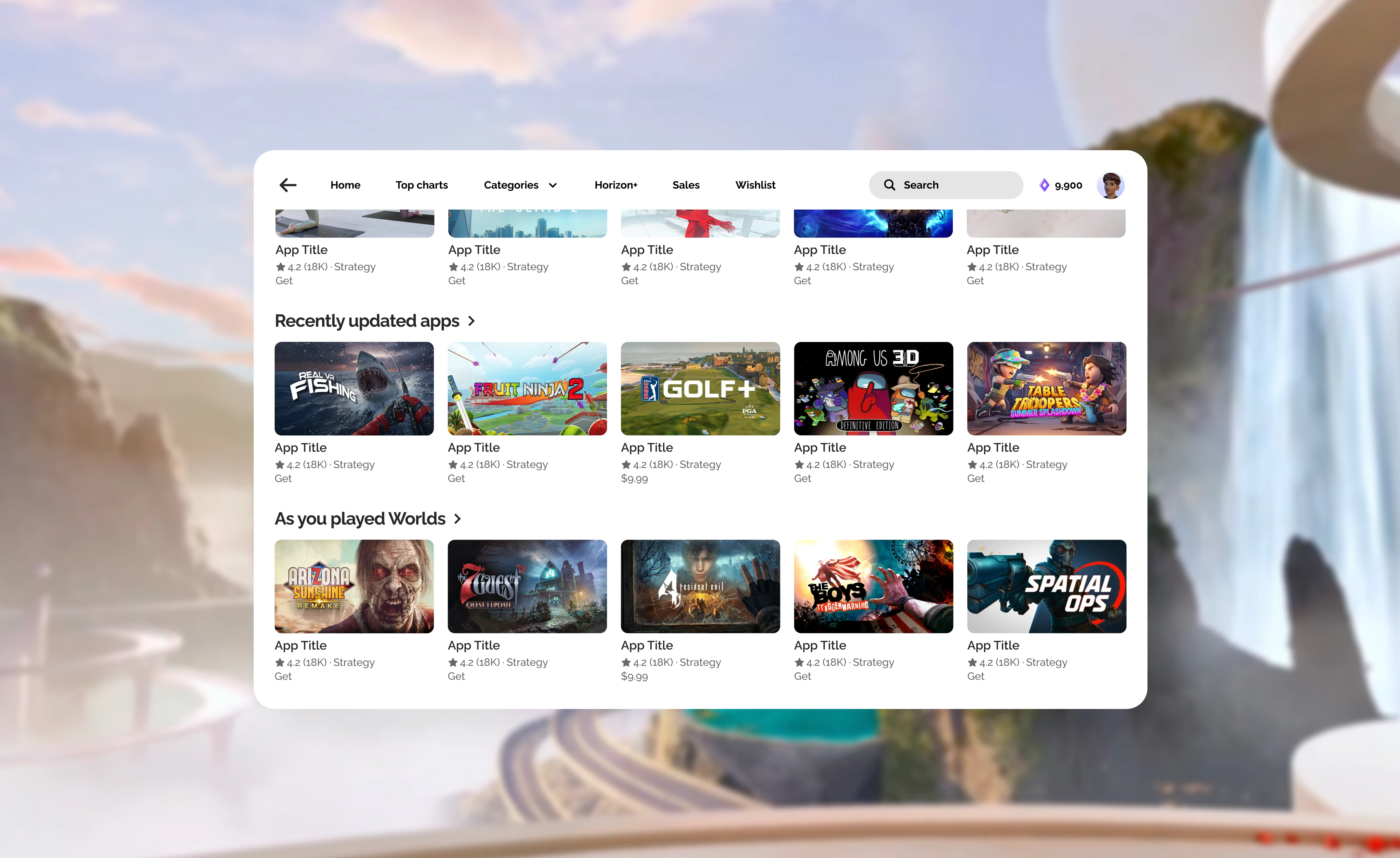
Scroll units feel disjointed with inconsistent grids, metadata, and badging. There is also no set rhythm with featured units appearing back-to-back or long periods of mundane shelves before another feature unit is seen.
This design does not scale to responsive panel sizes, additional languages, or large text for accessibility. Everything was originally designed to be fixed.
2026 marks the moment we're shifting Store from a model that's optimized the same for everyone to one where Store is tailored to you: to your interests, tenure, device, local, and accessibility needs. This has never been done before and requires a total reset.
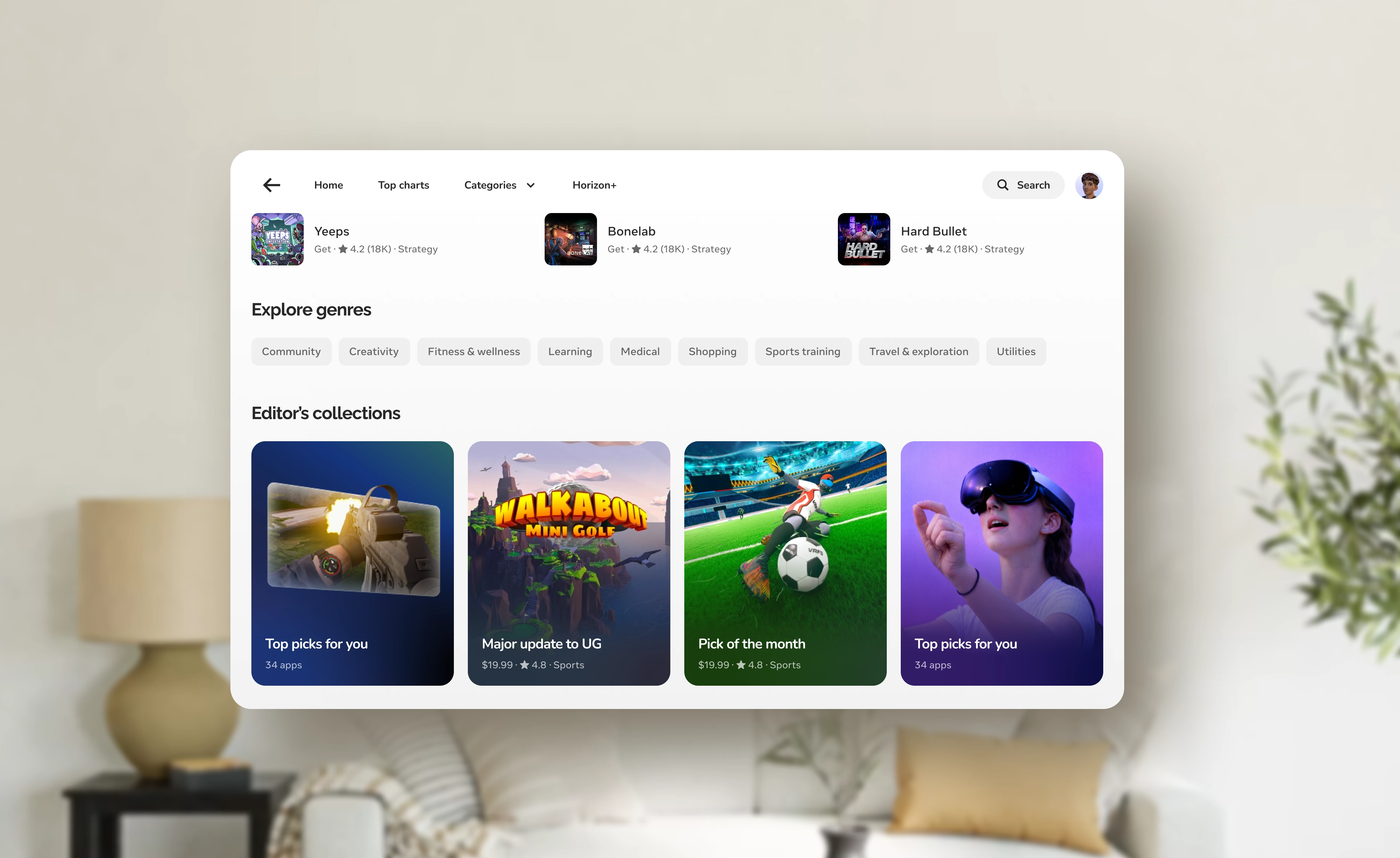
Editorial doesn't just surface apps — it helps users understand our platform and Meta's recommendations. Our ambition is to build a system of entry points across the full funnel so that editorial context reaches users wherever they are in their journey.
Prior to this work, Store was fixed (always 1024x640) with no support for localization or text resizing. This marks a transformative modernization to our components and design system—starting from the ground up.
I was the IC leading this work from strategic exploration through execution. I partnered with my team of 3 other product designers on the impact to specific screens that they worked on, and design leadership and XFN partners on strategy and vision.
This is a large body of work that spanned almost a year in total. Some pieces (e.g., featured card system) were shipped in 2025, others (e.g., above the fold) early 2026, and others remained on the product roadmap till my departure in May 2026.
Before jumping into the details of units or behavior, I started with the foundational question of the grid — specifically, the role of H-scroll in VR.
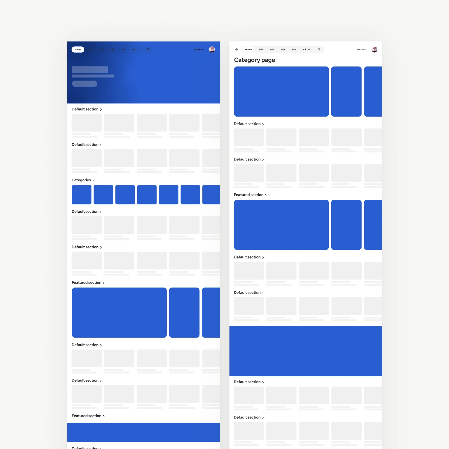
Every section is horizontally scrollable
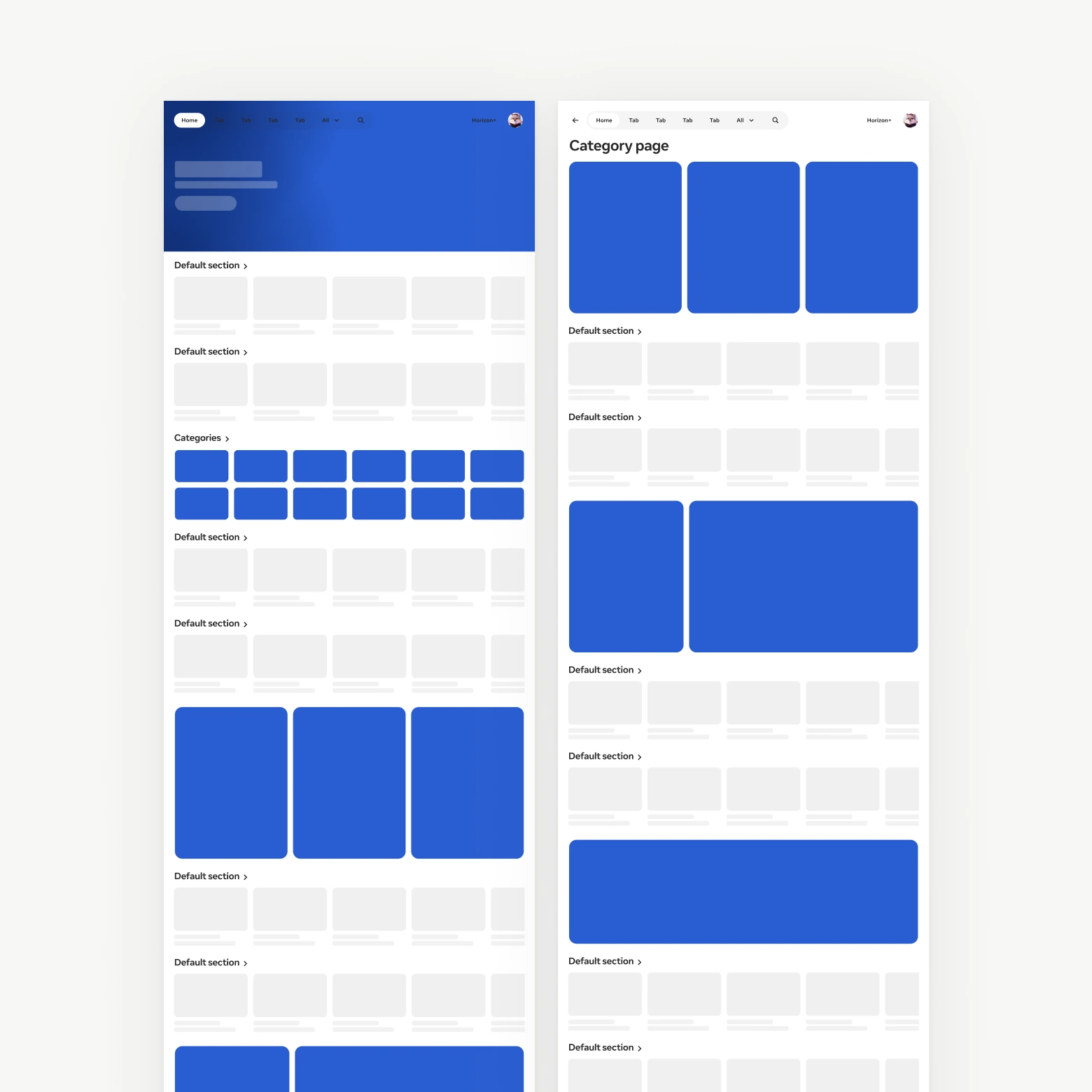
Only standard sections are horizontally scrollable
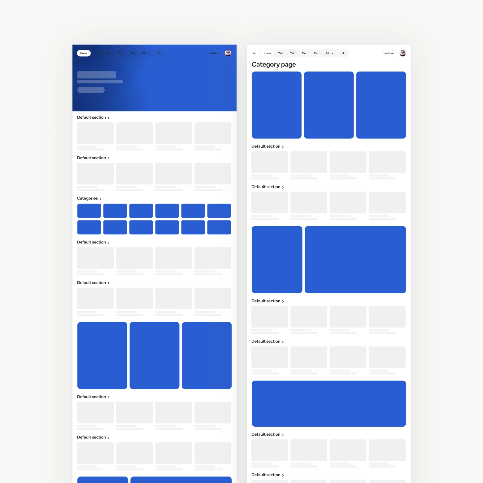
No horizontal scrolling
After aligning with the team on the decision to simplify by removing the volume of H-scrolls in VR, I started to explore and identify the key areas to improve:
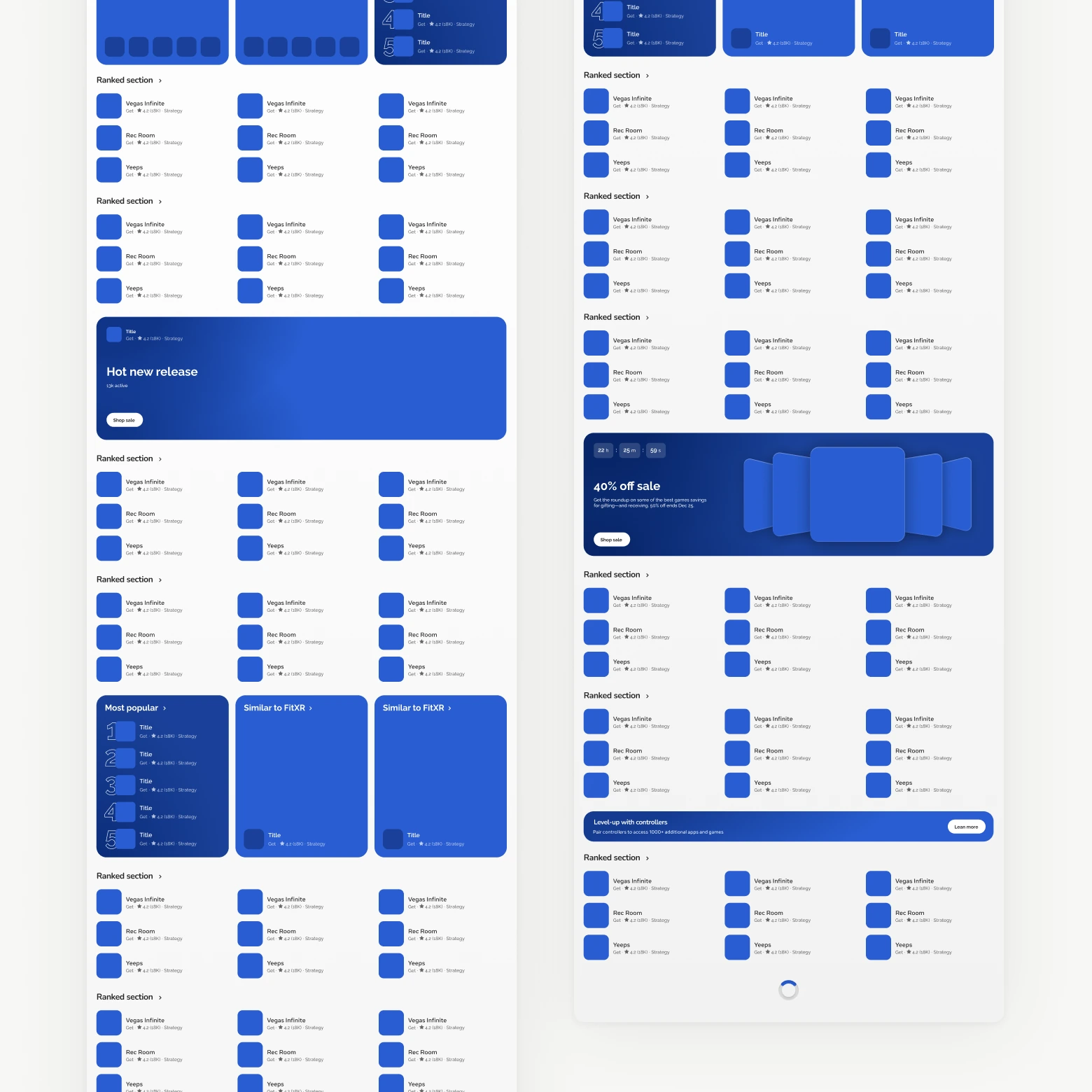
Predictable browse rhythm
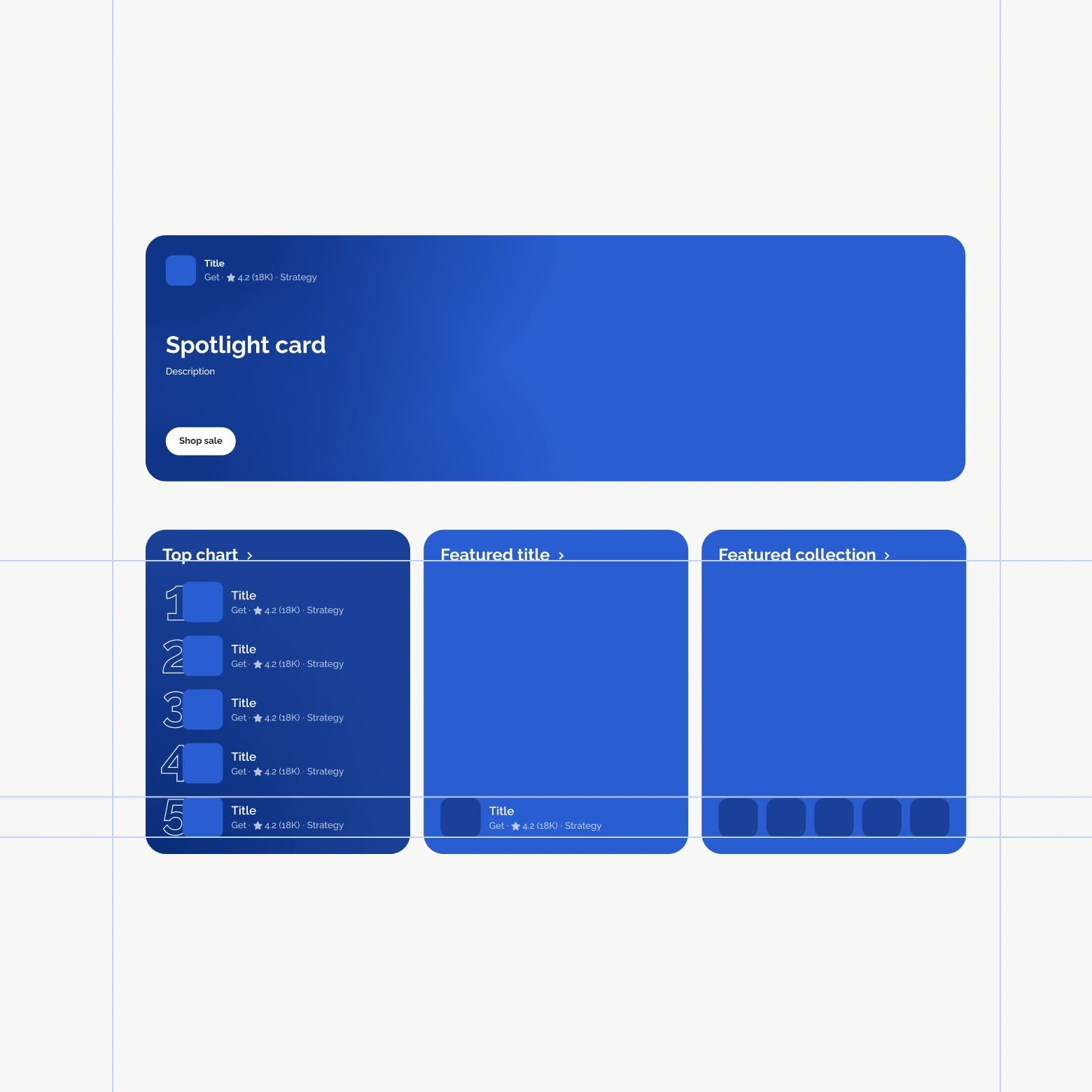
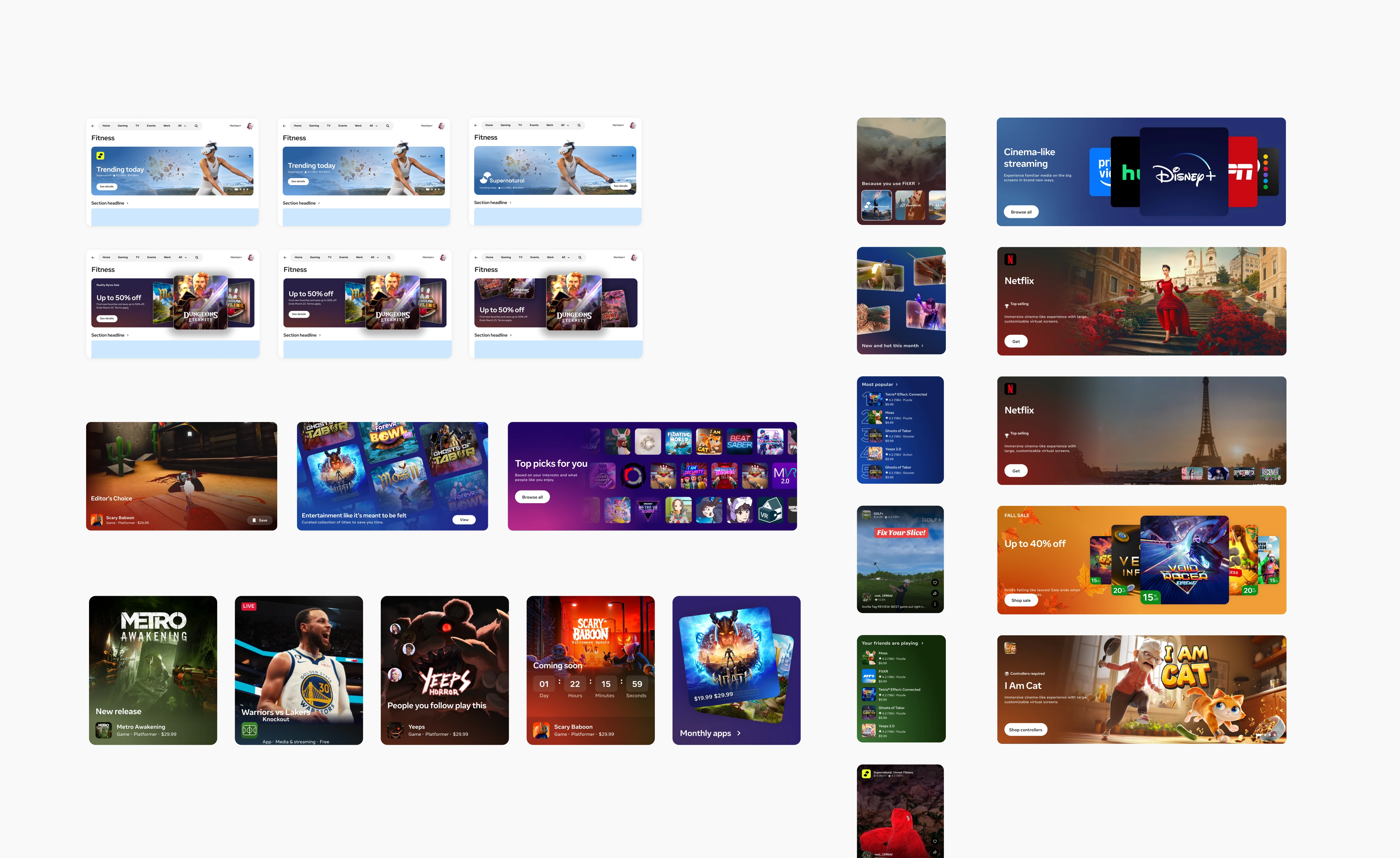
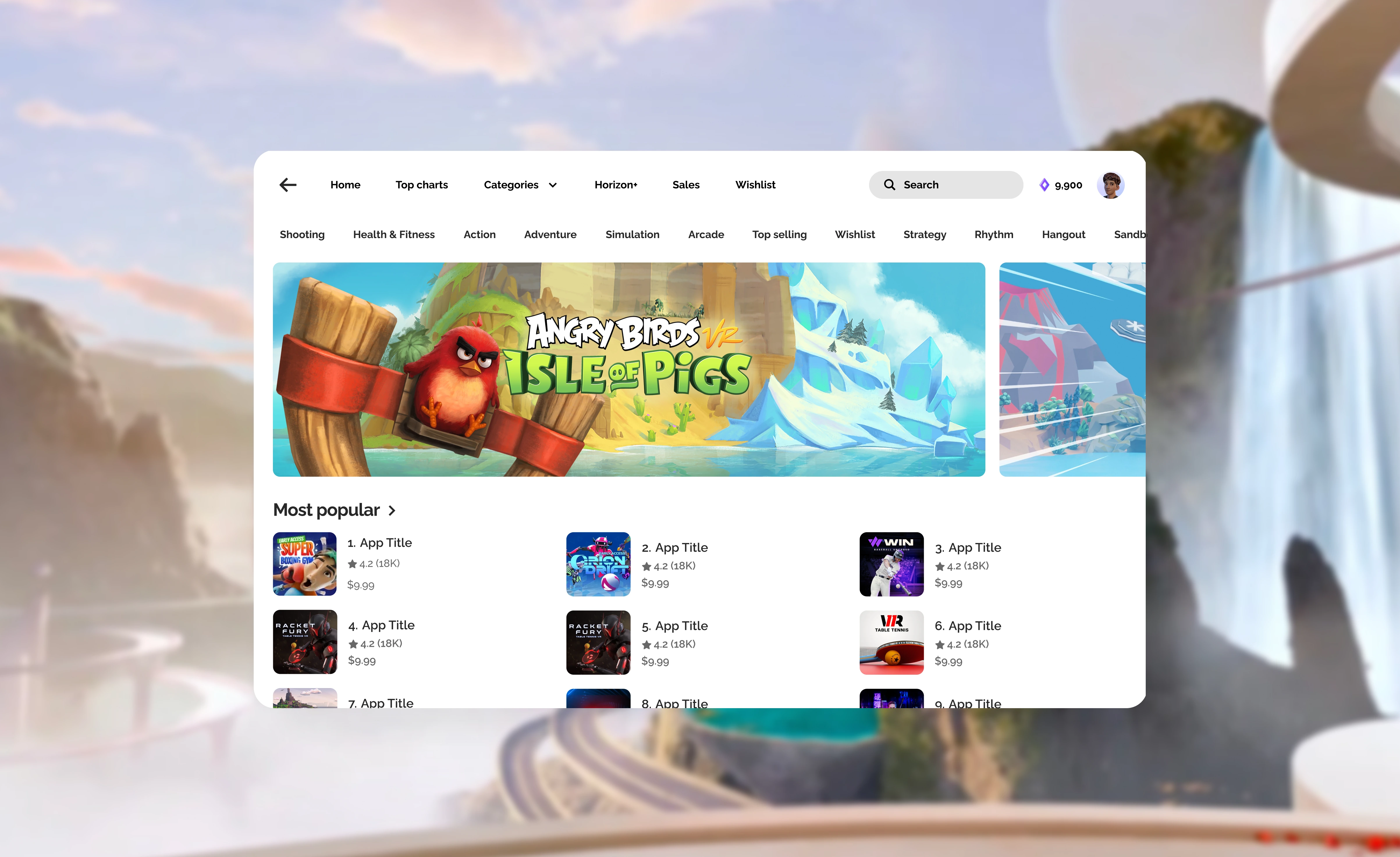
Standardized featured unit system
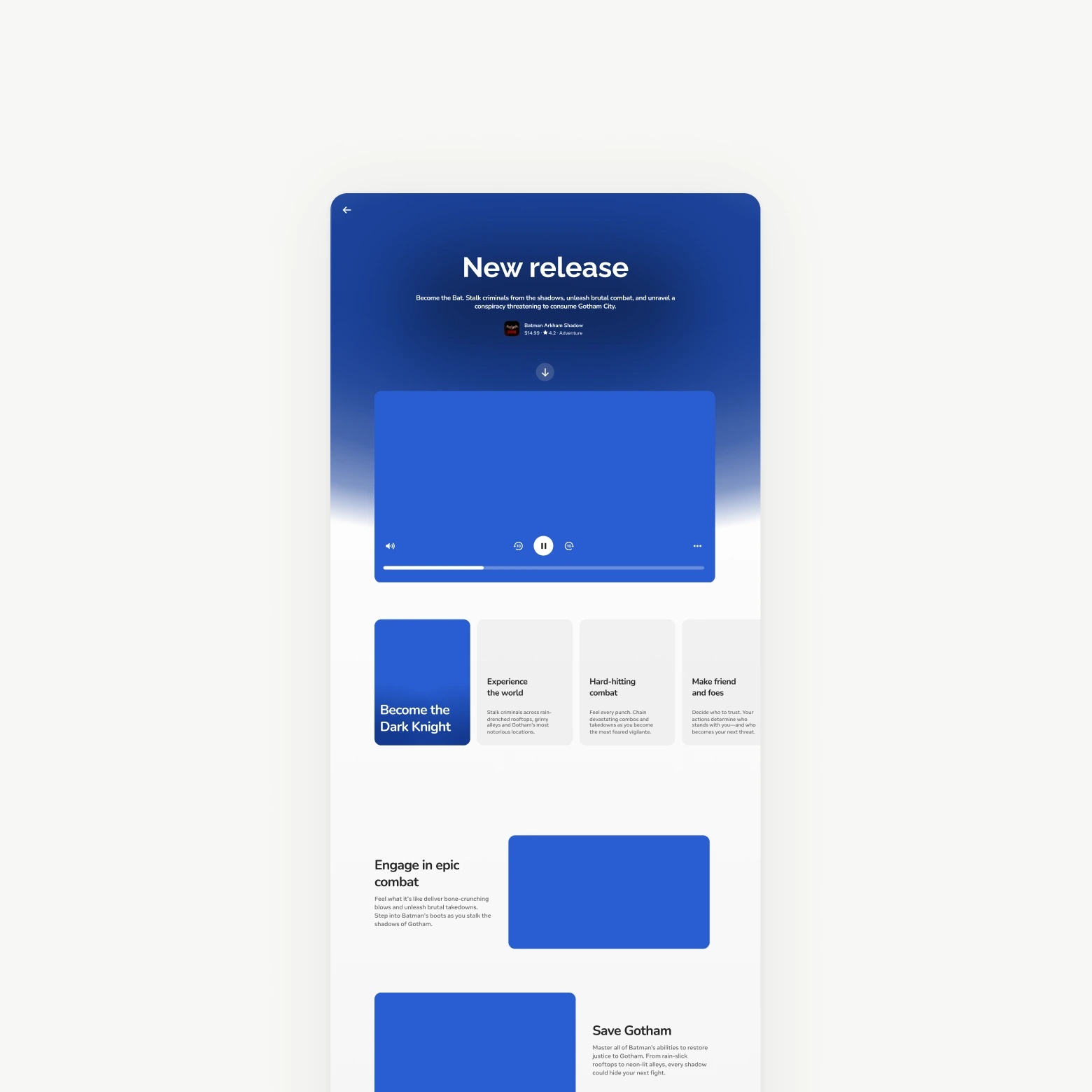
Editorial at the right times
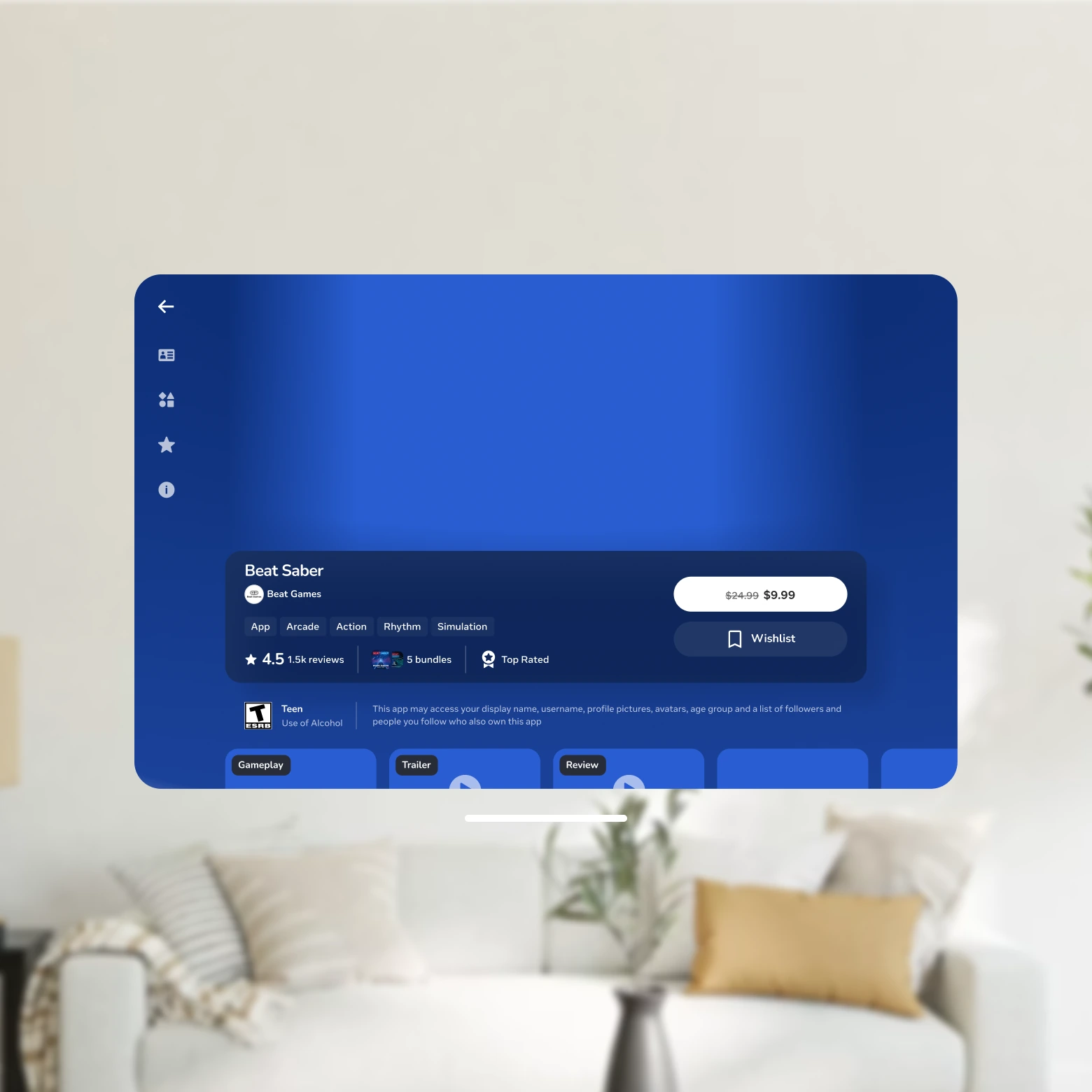
Immersive at the right times
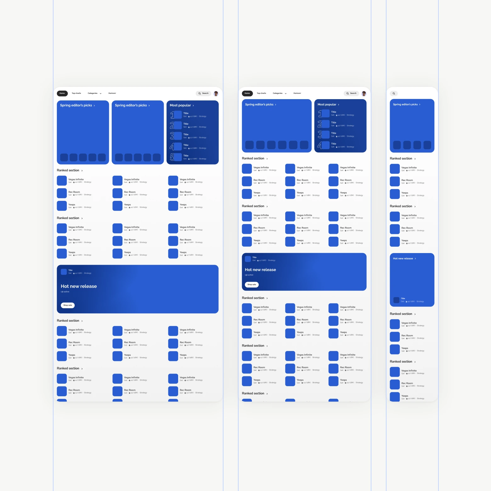
Responsive breakpoints
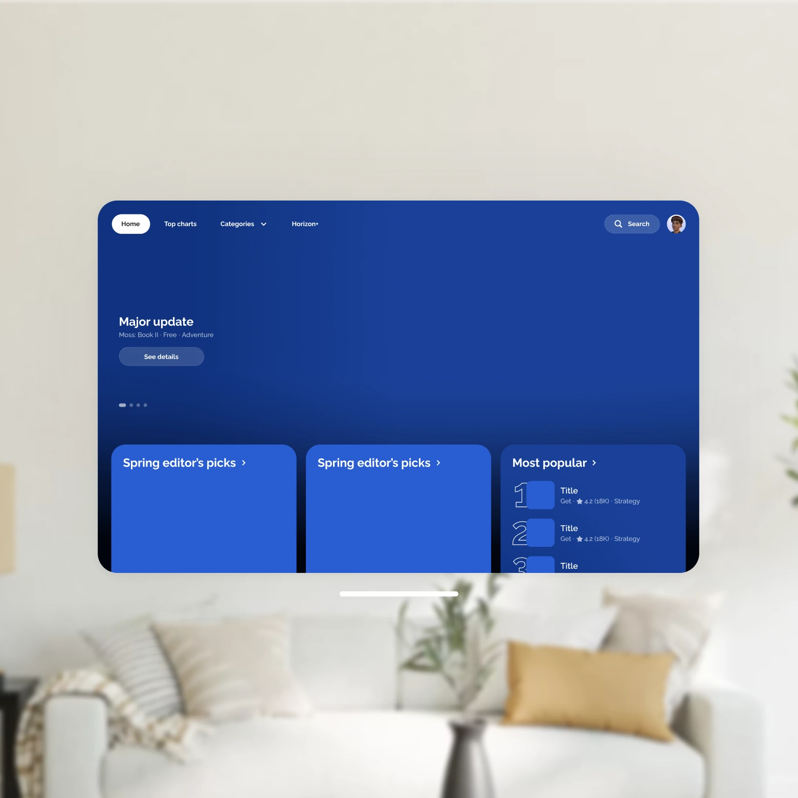
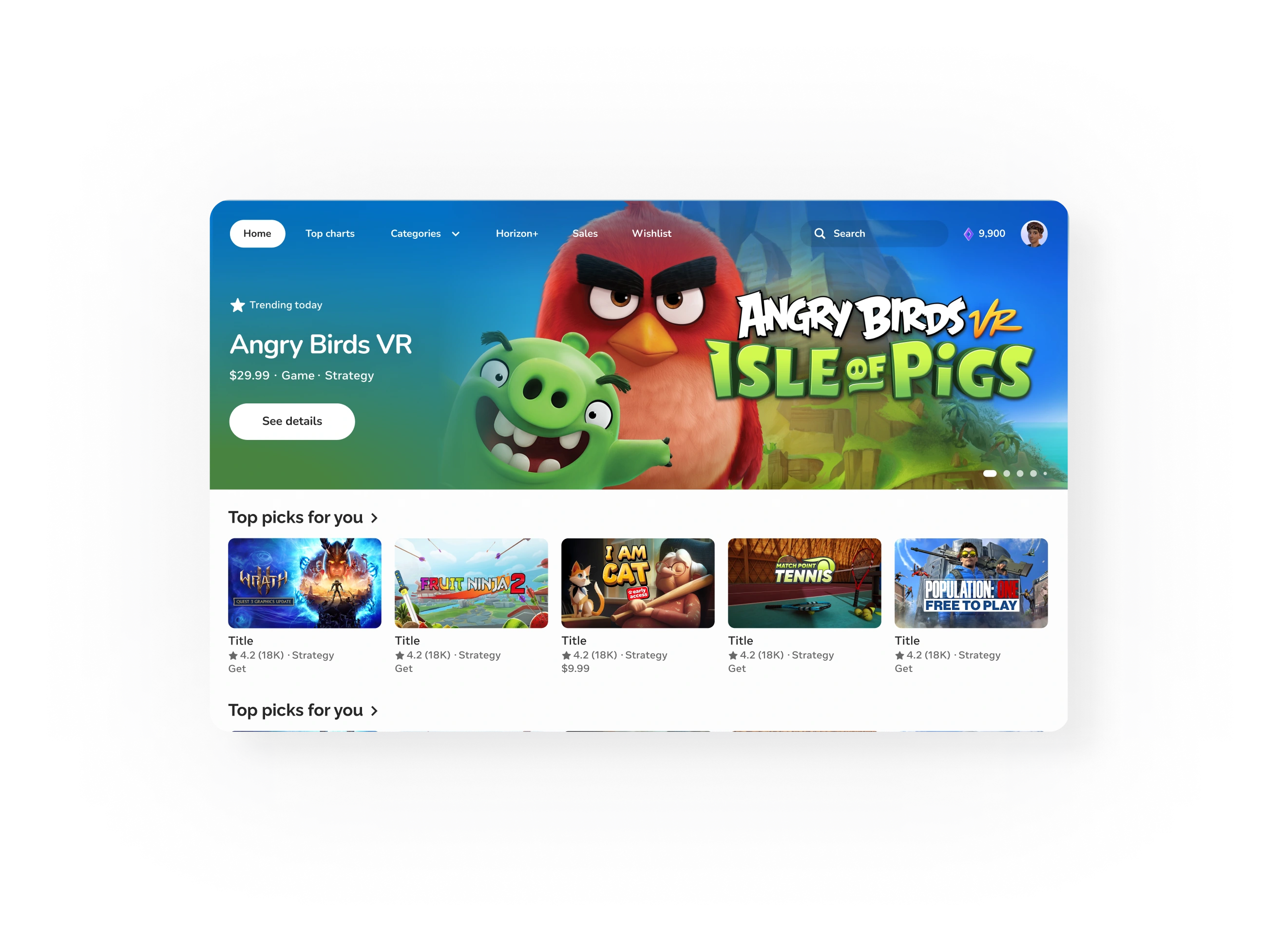
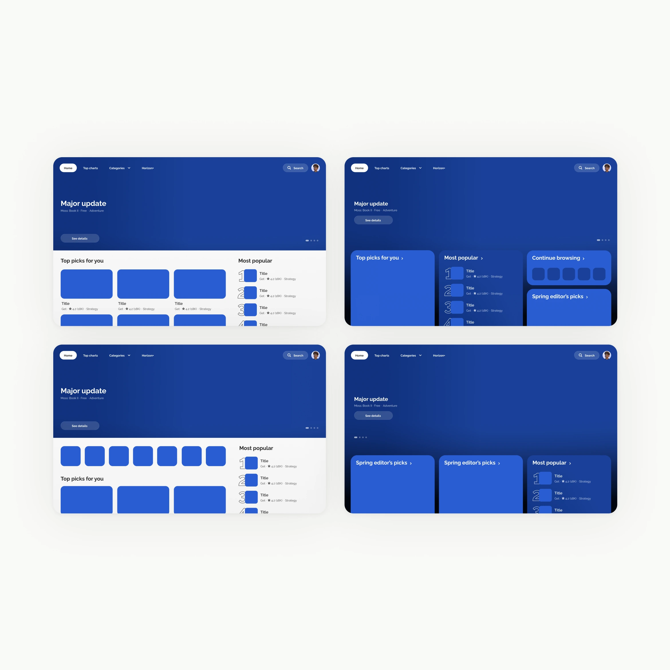
Optimized above the fold
Following this, I went deep into each of these areas, iterating and ideating on how to optimize the system.
Metadata system included 32+ variants
← drag to explore →
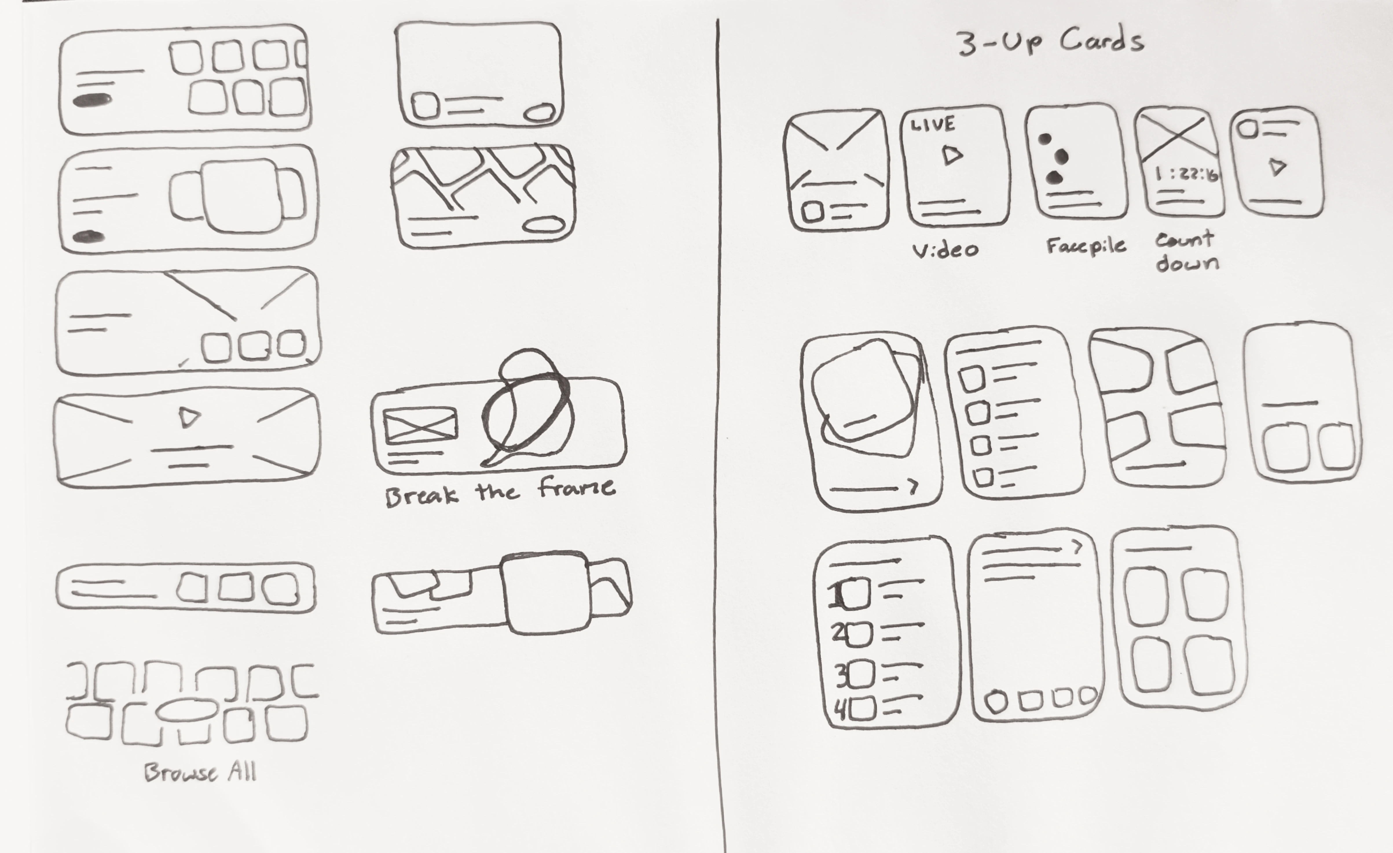
Initial explorations
Ideation
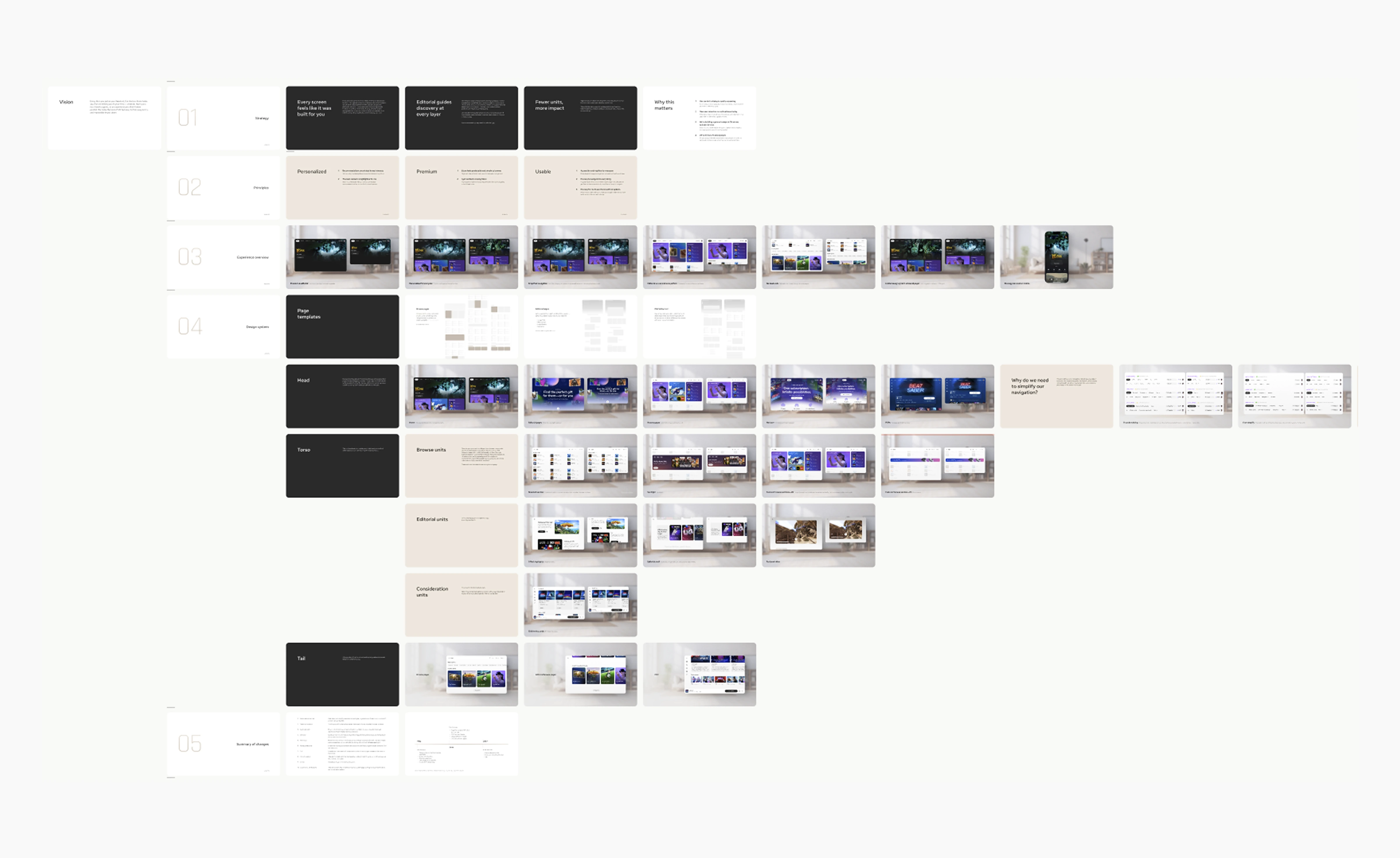
Leadership presentation
Motion explorations
Control
Key problems
Initial explorations
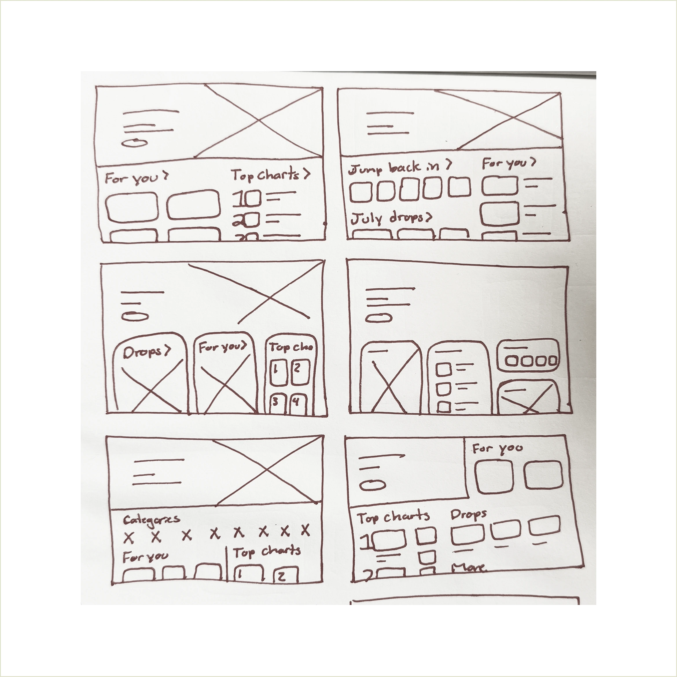
Wireframe explorations

Motion exploration
← drag to explore →
If we do nothing
The amount of items we can show will be severely limited on small panels and with large text
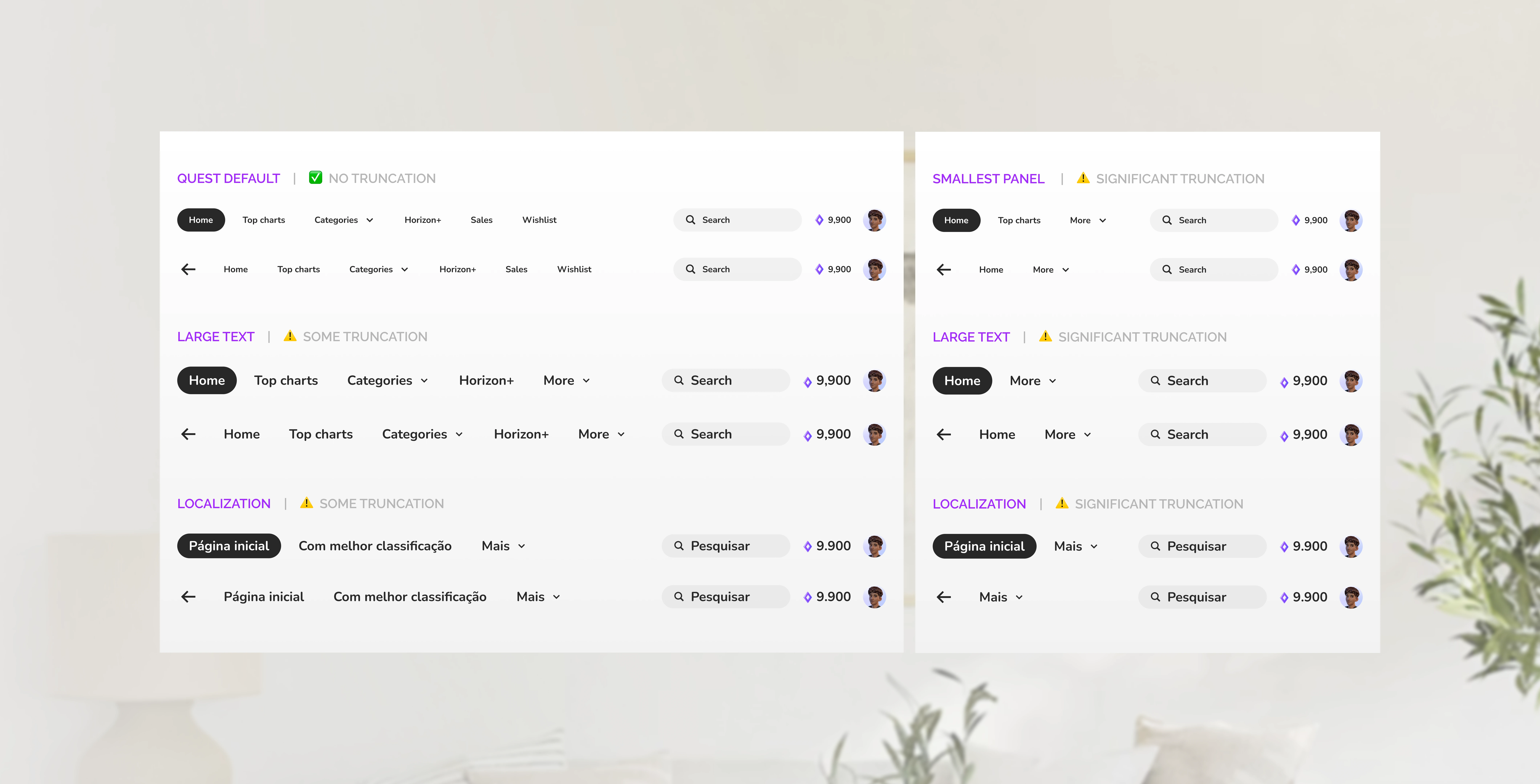
If we simplify
Truncation will be limited to edge cases only (smallest panels + large text)
Where will simplified items move to?
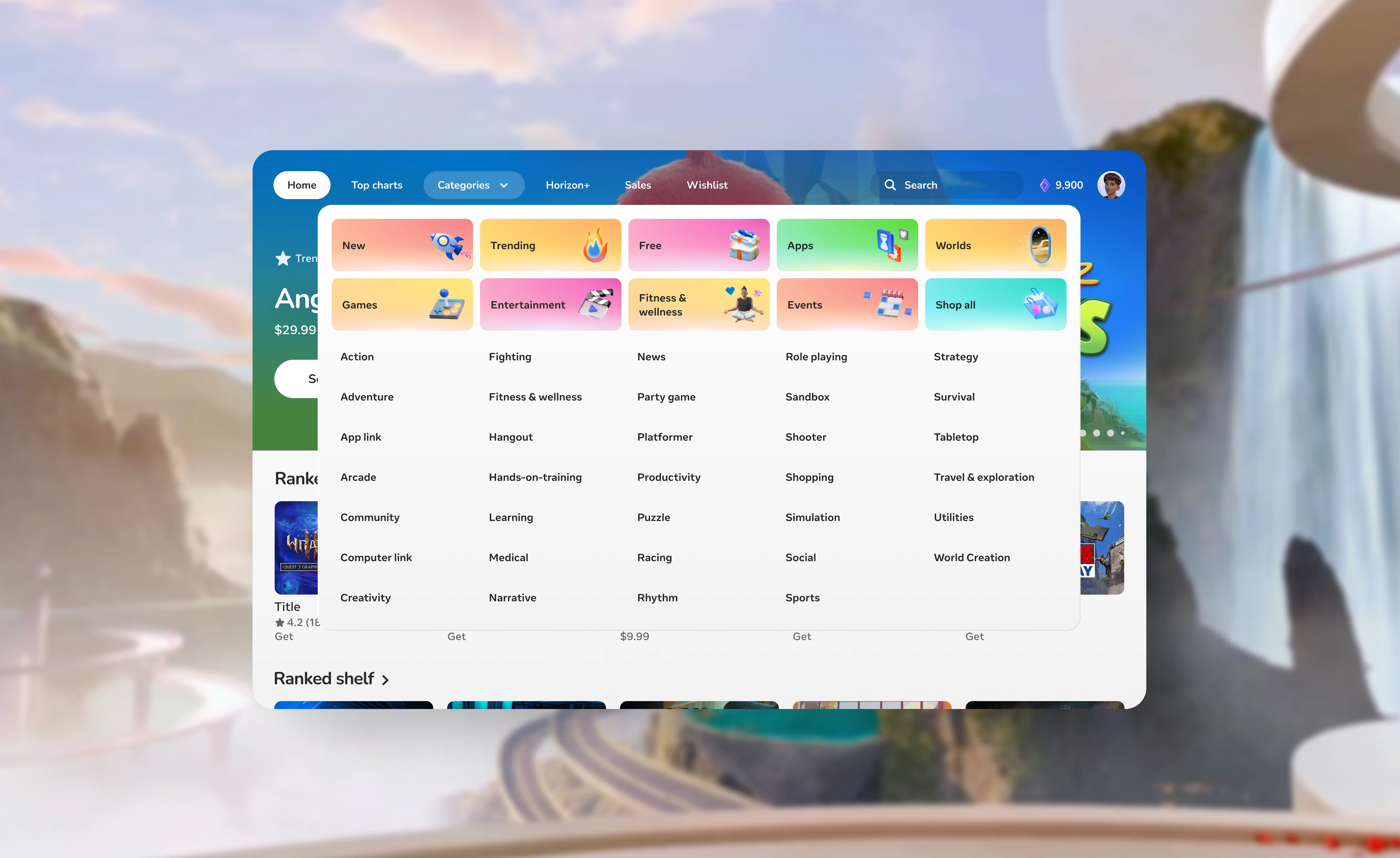
Sales moved to category dropdown and updated to become adaptable
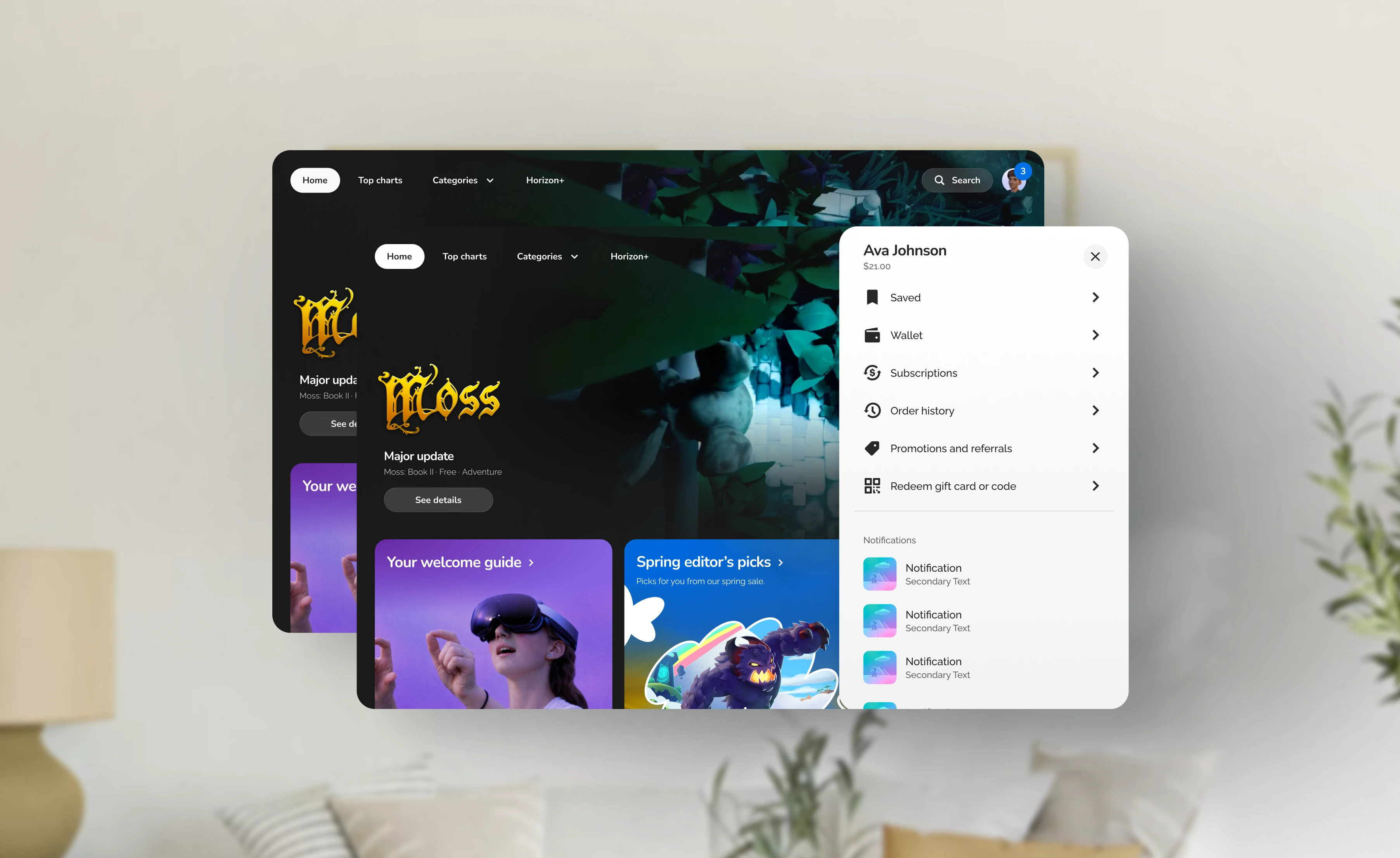
Wishlist and balance moved under profile
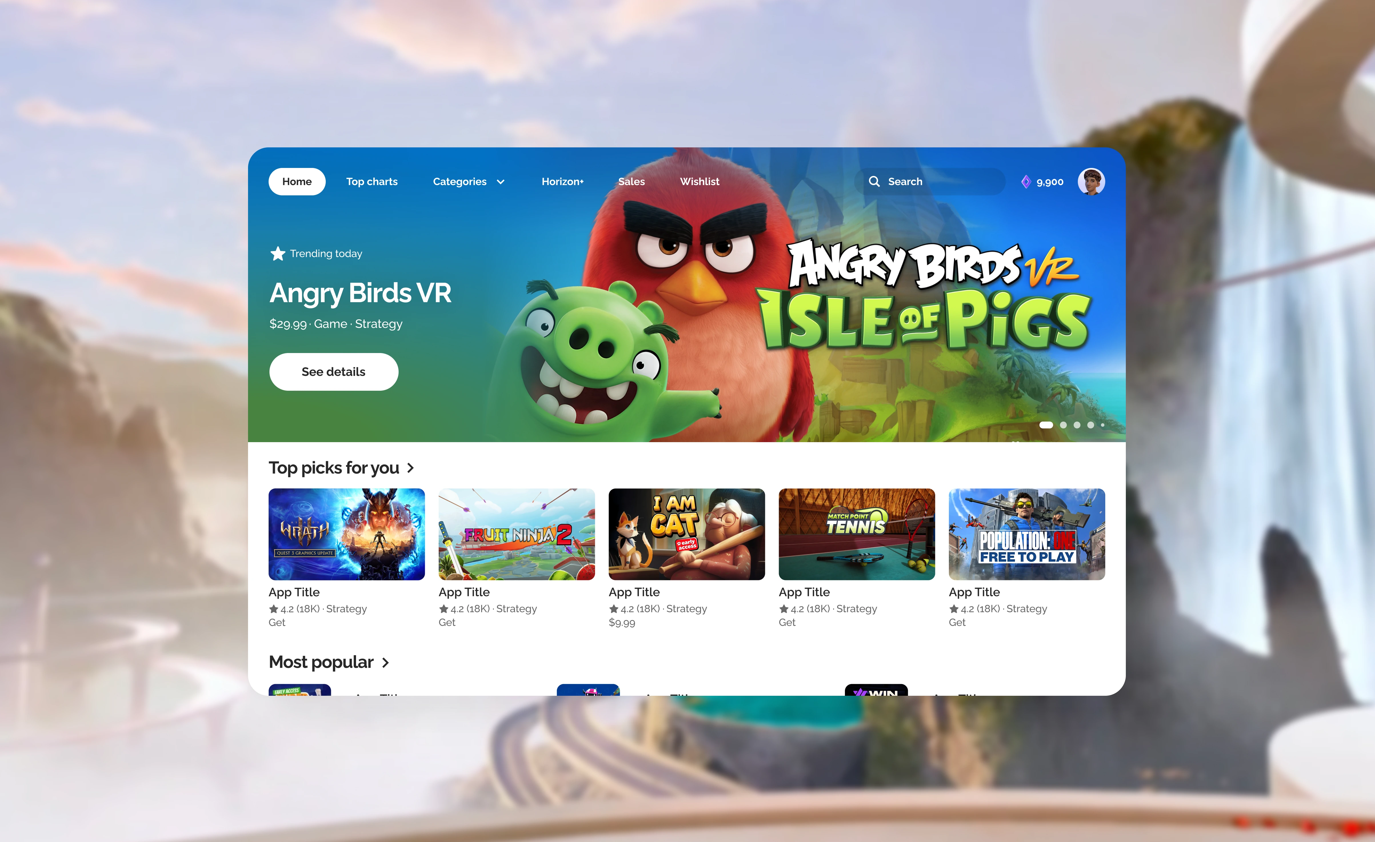
Before
After
Before
After
Before
After
Before
After
Before
After
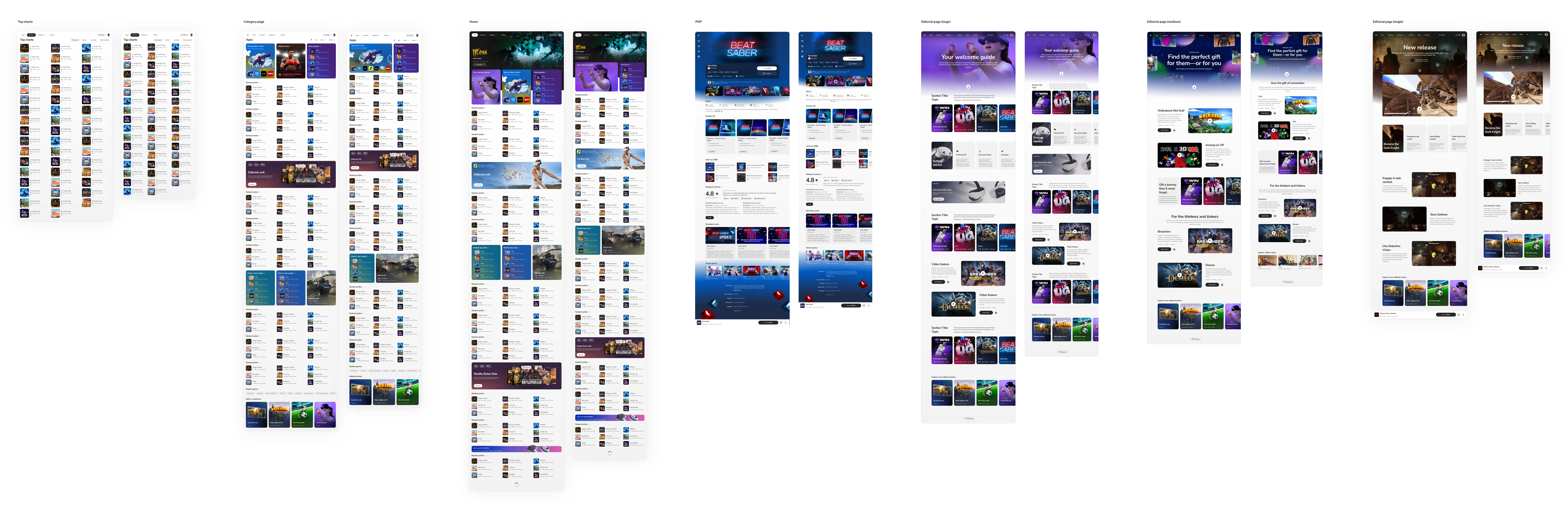
The updated design system unblocked responsive panels, AI automated personalization, made Store accessible to all, and simplified browsing — resulting in topline engagement, impressions, and title conversions.
Metadata simplification resulted in +1.31% engagement and made recommendations clearer with less redundancy, and responsive panels unlocked a more natural way of interacting with the app.
Allow top charts to be more flexible — showing a higher number of titles or alone without needing to group with 2 other cards. Additionally, I would look for more ways to increase the density of standard sections without moving to the list style section.